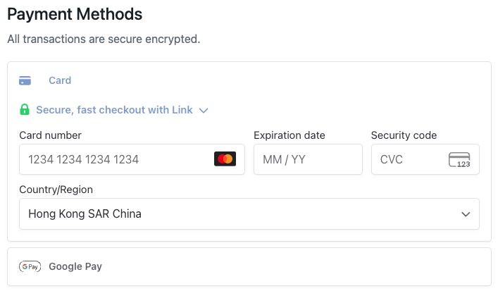
PaymentMethods
A payment methods component that integrates Stripe payment processing. This component displays the Stripe payment element and handles payment information collection and validation. It automatically shows a loading state while price point information is being fetched.
- Must be used inside
CheckoutProvider. - Supports Stripe payment element customization through options.
- Supports custom styling and layout configuration.
Props
showText
Whether to display the "Payment Methods" title and security message.
showText?: boolean = trueonPaymentInfoComplete
Callback function when payment information is complete, triggered when the user completes the payment form and payment element validation passes.
onPaymentInfoComplete?: (products: CheckoutCartItem[], totalAmount: number) => void| Parameter | Type | Description |
|---|---|---|
| products | CheckoutCartItem[] | Cart items array. Returns an array of cart items. |
| totalAmount | number | Total payment amount in cents (e.g., 9999 represents $99.99). For multiple items, this is the sum of all items |
options
Stripe payment element configuration options.
options?: StripePaymentOptions| Property | Type | Description |
|---|---|---|
| layout | LayoutObject | Stripe payment element layout configuration |
| appearance | Appearance | Stripe payment element appearance customization |
styles
Custom CSS styles for the component. Supports nested style objects for different parts of the component.
styles?: React.CSSProperties & {
  root?: React.CSSProperties;
  container?: React.CSSProperties;
}Note: To customize input field styles, use
options.appearanceinstead ofstyles. Thestylesprop only affects the component container, not the Stripe payment element inputs.
| Property | Description |
|---|---|
| root | Styles for the root container |
| container | Styles for the payment element container |
Usage Examples
import { PaymentMethods } from '@clickaroo/checkout-ui';

function CustomCheckout() {
  return (
    <PaymentMethods
      showText={true}
      onPaymentInfoComplete={(products, totalAmount) => {
        console.log('Payment info complete');
        console.log('Total amount:', totalAmount / 100);
      }}
      options={{
        layout: 'tabs',
        appearance: {
          theme: 'stripe',
        },
      }}
      styles={{
        root: {
          marginBottom: '20px',
        },
        container: {
          padding: '20px',
        },
      }}
    />
  );
}
Key Types
LayoutObject
payment element layout configuration:
export interface LayoutObject {
  type: 'tabs' | 'accordion' | 'auto';
  defaultCollapsed?: boolean;
  radios?: boolean;
  spacedAccordionItems?: boolean;
  visibleAccordionItemsCount?: number;
}| Field | Type | Description |
|---|---|---|
| *type | 'tabs' | 'accordion' | 'auto'; | Layout type for the payment element |
| defaultCollapsed | boolean | Whether accordion items are collapsed by default |
| radios | boolean | Whether to use radio buttons for payment method selection |
| spacedAccordionItems | boolean | Whether to add spacing between accordion items |
| visibleAccordionItemsCount | number | Number of accordion items visible before collapsing |
Appearance
payment element appearance customization:
export interface Appearance {
  disableAnimations?: boolean;
  theme?: 'stripe' | 'night' | 'flat';
  variables?: {
    fontFamily?: string;
    fontSizeBase?: string;
    colorPrimary?: string;
    colorBackground?: string;
    colorText?: string;
    borderRadius?: string;
    // ... many more styling variables
  };
  rules?: {
    [selector: string]: {
      [cssPropertyName: string]: string;
    };
  };
  labels?: 'above' | 'floating';
}| Field | Type | Description |
|---|---|---|
| disableAnimations | boolean | Whether to disable animations |
| theme | 'stripe' | 'night' | 'flat' | Predefined theme for the payment element |
| variables | object | CSS variables for customizing colors, fonts, spacing, and other visual properties. Includes properties like fontFamily, fontSizeBase, colorPrimary, colorBackground, colorText, borderRadius, and many more |
| rules | object | CSS rules for fine-grained styling control. Maps CSS selectors to style properties |
| labels | 'above' | 'floating' | Label positioning style |