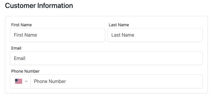
CustomInfo
A customizable customer information component that collects and validates customer details including first name, last name, email, and phone number.
This component uses useCheckoutContext to manage customer information state and provides built-in validation.
- Must be used inside
CheckoutProvider. - Supports custom styling and layout configuration.
Props
showTitle
Whether to display the "Customer Information" title.
showTitle?: boolean = trueshowLabel
Whether to display labels for input fields.
showLabel?: boolean = truestyles
Custom CSS styles for the component. Supports nested style objects for different parts of the component.
styles?: React.CSSProperties & {
  root?: React.CSSProperties;
  container?: React.CSSProperties;
  input?: React.CSSProperties;
}| Property | Description |
|---|---|
| root | Styles for the root container |
| container | Styles for the form container |
| input | Styles for input fields |
Usage Examples
import { CustomInfo } from '@clickaroo/checkout-ui';

function CustomCheckout() {
  return (
    <CustomInfo
      styles={{
        root: {
          marginBottom: '20px',
        },
        container: {
          padding: '24px',
          borderRadius: '8px',
        },
        input: {
          fontSize: '16px',
        },
      }}
    />
  );
}